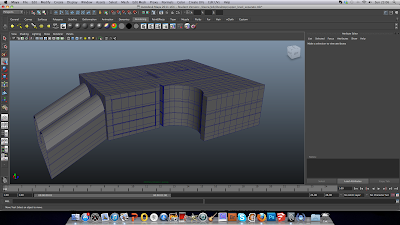
After I removed the other sections of my environment, I started to UV map the top tier. Once again using automatic mapping as the scene is very square and primarily basic in shape.
 |
| Typology of upper level |
I was actually very pleased how my reference checker pattern rested on the mesh.
The checker pattern was consistent throughout the environment. However, I still had a lot of sewing to do. I needed to do this so when I come to apply my 'theme' am able to easily identify the areas in which will need colours and textures.
Here is my UV map for the environment pieced together. Clearly identifying the important areas of the map.
I then followed the same procedure as I did with my assets. Took a UV snapshot in the editor, saved it as a targa and opened it into Photoshop. I then applied the 'blue' theme in the relevant places on the UVs. I then checked the resolution of the image and imported it back onto the model in Maya. The above image shows the 'Phong' material I used with the colour map on top. I chose a Phong material as alongside my texture maps, I want the environment to have that sleek and clean feel, just like Mirror's Edge, Wall.e or Portal did. I think a shiny and reflective surface really accentuates that theme, so I found it important to use it as a primary material in my environment. It's really coming together!
After my colour maps were applied, I then started making the texture that would appear on some surfaces. I decided I wanted to adopt a basic tile pattern on focal areas of the environment, such as the support column and blue wall behind the ticket vendors. To do this, I went back to my UV snapshot of my environment and began using the 'ruler' tool to create my tiled pattern. I did this in black and white of course as Maya reads that information as a height or bump map. The black areas will cut into the surface directly. I wanted the blue areas of my environment to have a smaller tiling pattern than that of the floor, so I worked gradually to reach the two different looks. I used a thin brush when drawing the lines for the tiles. This is so the black information won't cut into my model surface to thick.
Here is a quick render of my custom made texture. I imported this by setting it as a 'bump' file on the material attributes editor. However, I think the lines are far too thick from Photoshop and thus made the width of the tiling grout larger.
That is when I decided to use CrazyBump. I did this so I could actully see my texture taking shape from the Photoshop file. I chose to make it as a height map file so that it would create that 3D effect on my surfaces. Everything seemed to look fine here.
However, after I did a test render, Although the lines were a perfect thickness; There seemed to be a weird pattern forming on the individual tiles. I spent a lot of time looking up solutions and trying different mapping methods, but nothing seemed to change it. It was then I decided to just go back into Photoshop and rework into the line thickness of my original tiled pattern.
After changing my line thickness, I then imported the bump map again onto my environment. This time the lines were much better! I then did some small adjustments to the map depth in the editor and managed to get a nice subtle yet sleek look.
Here is an example showing the flooring too.
Overall I am really pleased with my colour theme and textures. I am finally now ready to import everything into UDK : )
Oh and here is a little teaser I made for myself, just so I could get some visualization of my final outcome. Getting very excited about this!


No comments:
Post a Comment