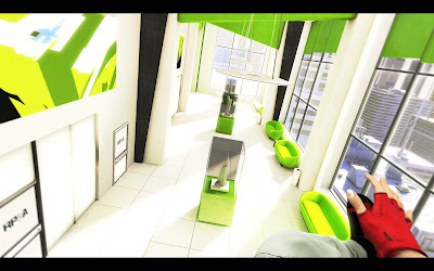
Although I have already looked into the visual style of Mirror's Edge, I wanted to reflect on my comments and thoughts at the time. It was the first game that came to mind when I imagined the visual style of my own futuristic environment. In my personal opinion, Mirror's Edge is easily one of the most beautiful and visually impressive games out to date, simply for it's unique application of light, colour and texture. The beauty behind the game is the simplicity and that it does not need to have complex environments to make something look visually appealing. The basic shapes, bold colours and lighting methods gives Mirror's Edge that one of a kind visual. It's so unique that it really cannot be compared to anything else in the gaming industry, especially from a game play and narrative perspective.
The game takes place in the near distant future. A future taken over by the government fueled by money and greed. Regulations and procedures have become tight, so much so civilian life is kept under a close surveillance, there is no freedom for people anymore. That's where Faith comes in, the protagonist of the story. Known as a 'runner' she uses a combination of martial arts and parkour skills to relay important information that is normally restricted by government. She is agile, stealthy and tough, utilizing her skills on the rooftops of the confined metropolis, to bring justice and freedom.
The generalized theme of this game is that of the future. I ask myself the question again, What does our future hold? Mirror's Edge uses another example, just like Wall.e in how the human race can develop in the future, especially from our relatable present. The game highlights the prospect of government control, lack of human freedom and a money invested metropolis. Money is actually very well portrayed in Mirror's Edge and is identified through the sleek and stylish interior designs, as well as skyscraper architecture. Primarily everything is a wash of clean white, with bright singular tone colours. The use of colour is used to highlight areas of interest or generalized theme of an environment. Shapes and textures are also kept to a minimum to further express the cleanliness and futuristic theme.
I think the environmental designers of Mirror's Edge used colour, texture and light to portray scenes with different interactive values. Red indicating areas or objects to guide you through the scene, or blue for objects you can physically interact with. Other colours are used to match and compliment that not only important visual, but also that game play aspect. It is interesting to see how the developer's behind Mirror's Edge expressed their perception of a futuristic earth. Although fictional, the concept behind the game can very easily be an extreme representation of our present and what it could become. Our current present is that of greed, money control and government control. Hypocrisy, nievity and immoral official beliefs are becoming problematic by the day, so much so the concept of Mirror's Edge could very much come true. The concept of money, evolution of interiror and exteriror design is expressed through the futuristic style and application of colour, light, texture etc.
Maybe, I could look it as a 'Mirror' into our future?


No comments:
Post a Comment