Seating:

I started on making the seating for my station. However the first set of models I was really displeased with. I think this is because they looked more like seating at a hospital to me. The legs of the chairs were too obstructive and not as practical as I believe they could be.

After much deliberation, I eventually became satisfied with the seating layout as pictured above. I think the way support brackets or 'legs' are far more practical and suitable for an underground environment. Primarily because it adds more space and leg room, as well as room for baggage etc. This also limits the chances of getting things caught or obstructed by the legs.

Here is a final test render using a sun light in mental ray. The UV mapping and colours are applied here. Much better!
Vending Machine:

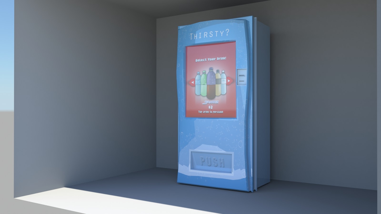
Here is a test render using a sun light in mental ray.
Bin:
 |
| Test render of bin |
Terminal:

For my ticket terminal machine. I added two areas of green which are to represent the 'accepting ticket' procedure. The potential traveler will put their ticket into the front slot of the machine, if it turns green and the top beacon does to, you have successfully been granted access. Here I am using colour to communicate a situation. Green being the colour in this circumstance is highlighting 'good'. Also by using no symbols or text, colour is actively expressing the situation on it's own, which is something I wanted to achieve from the beginning. When it comes to lighting my environments, I will make both areas of green illuminate, to not only accentuate the 'acceptance' situation, but also to show how light compliments colour. Also how it is used to be potentially instructional.
Escalator:

For my escalator I followed the same colour themes as the rest of my models. It was more so important to make this asset correspond more so with the environment space. As technically the escalator is more part of the environment build than any other assets. I did this by adding a 'feature' are of blue down the center of the object and made the rest a wash of brilliant white. Just like the theme of my environmental space.
No comments:
Post a Comment