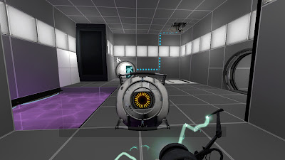
You play as a test subject within a series of futuristic science laboratories. Monitored and tested by artificial intelligence. Your goal as the player is to use a device known as a 'Portal' gun to solve puzzles and progress to the next testing area. Throughout the game, you are being monitored by an AI machine, who encourages, insults and intimidates you. Testing not only your mental but physical strength and teasing you with the prospect of 'freedom'. In this perception of the future, machine has taken dominion over man. Testing their mental and physical wit, which is consistently insulted and teased. The human race is a science project now, controlled and enforced by robots to past their 'tests' and encouraging them to do so for 'freedom' and their own good. Although the concept seems rather cynical, the game play itself is very satisfying and somewhat humorous, but that's primarily due to the dialogue of the AI in the environments.
The environmental design like Wall.e and Mirror's Edge, is very sleek, simplistic and bold. Basic shapes, singular tones, minimal textures and reflective surfaces really gives us that sense of the 'future'. The technology in the game such as mechanical doors, AI and interfaces also compliment the visual style of the environment. Although being tested on like a lab rat, you have a real sense of security within the spaces. Small confined, white washed rooms, brightly lit and bold make you feel very aware of your situation. There are no shadows or mysteries, everything is as it appears. Colours guide you to points of importance and light accentuates that.
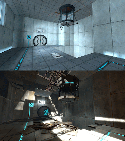
However, in Portal 2, a helpful AI encourages you to escape and manages to break you as the player, out of this 'testing' hell. When you first encounter 'freedom', everything is shrouded in shadow, the infrastructure damaged and torn. Light is no longer there to comfort your direction. You're left free in a vast new environment, mysterious, unknown and most certainly dangerous. New types of lighting methods are used to express this deteriorating world. Dark shadows and contrasting colours, even natural light bursting through eroded surfaces shines through, casting mystery and uncertainty to the scene. This time as the player, you don't know where to go, no one can direct you and you no longer have the light to keep you safe. Ironically enough, it seemed much safer in the place which kept you a prisoner.
It's interesting to see how artists behind Portal 'use' light to accentuate the important visual elements of the game. Utilizing colour, texture and most importantly light to express emotion and develop immersion. Using light, singular colours and basic textures to comfort the player, even in their prisoner like role. Then contrastingly exposing them to the unknown, their 'freedom' being dark and uncertain. It's also interesting how the roles reverse in that story progression. Although light is very much being used to identify positive and negative situations, it also contrasts the emotions you would expect to feel. For example, when you feel the most safest in the light, in the story you're realistically being kept a prisoner to machine. However, when you finally escape and earn your freedom, your fearful to pursue it, as darkness, mystery and unrecognizable environments take away your comfort.


No comments:
Post a Comment