Friday, 31 May 2013

The Final Outcome

Since the beginning of my project, I have developed my work in so many ways. To begin with my concept of positive and negative lighting was soley 'just because I wanted to'. However, from research it became more apparent just how import light is in video games and how it is utilized to convey every aspect in it's design. Most importantly my focus was the light accentuates colour, texture, theme and 'emotion'. How light is used to manipulate the feelings of a person. An environment doesn't need to physically change in order to express a change in emotion. As I proved in my renders and research, texture, colour and material remained untouched throughout my process. Yet through lighting in different ways with certain techniques, altered the mood instantly.

Also up to this point I realized just how powerful light and colour are. In the earlier parts of BA8 I made advertisement posters to accentuate the theme of the futuristic environment. However, now after looking at how powerful light is on it's own. I have decided not to use any of my posters at all. Although they still conveyed the theme and meaning very well, I didn't feel it was needed to get my point across. This project for me is all about light. How light manipulates it's environment and generates emotional themes. If I can effectively light my scene to express those feelings, posters will only obstruct or distract what's important.

A lot has changed for me in this project. Such as my over ambitious decision to make a map on such a grand scale. However, in the time frame it would have been too much. In making that decision though, I was able to focus more on a singular area and generate something with much better quality. Although it was a sacrifice, it was certainly worth it. Also deciding not to use UDK was a bit of a frustration for me, as I understood the importance of the engine. However, I found it too difficult to pursue that ambition without the help I required (to no fault of the tutors) I was still able to show evidence of how important it is to make objects efficient enough for exporting and also how to transfer maps. I did take something very important away from it, even though I didn't use it in the end.


The Renders

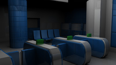
Here are the final rendered screenshots of both lighting variants. They are each rendered at HD720 and took a good hour or so per render. I am very pleased with the outcome and now able to make my final project video.

The video will include a panoramic of all the screenshots and fade in and out of each other so we can see how the lighting changes. I will also accompany the scenes with my underground recordings I made earlier to add that sensation of movement without physically averting the viewer from the relevant points. I will make this video using After Effects as believe it will be the most effective and efficient.


Back to Maya: Negative Light

Having already played with lighting earlier on. I already had a vision in mind for how I would create my negative lighting variant. By saying negative it isn't meaning 'scary' or fearful, but just less welcoming than the positive light. From my tests in the previous post, I really liked the effect singular lights can have on the surrounding environment, especially using a blinn or phong material as it's so reflective. 

To do this I looked at the way in which my positive lights were created and then decided to break them down gradually. To achieve this I wanted to make the environment appear 'broken' and with that theme in mind, made me visually what could change in the scene. For example lights not working or dimmed, but in doing so will just touch the edges of surrounding objects. Given that 'depth' of light, but making it so the viewer has to make up the rest through imagination. From my research report, it is in darkness we have the 'unknown' and our imaginations mock up what could be. Keeping that in mind I should be able to portray the same effect.


I decided to keep the largest decorative wall panel 'on'. However, this time with a very small 'glow' affect on the material and also lowering the intensity of the area light.


 I also removed some of the floor lamp spot lights and adjusted their intensities too.

For my ticket terminals I wanted to do something different yet effective. I wanted to try again at making objects emit light, this time I want the 'beacon' features of my terminal to shine. I consulted with a friend of mine who is familiar with lighting methods and he taught me a new way to get objects to emit light. How I went about it was to reopen my UV snapshot and colour my terminal entirely in black APART from the areas I want to illuminate. Those areas were kept white. To add this to my terminal model, I went into the Attribute editor and under 'additional colour' I chose the targa file. I then selected the relevant colour for the areas I wanted to illuminate, but using the ink dropper tool on existing models. This setting adds an additional layer to the colour maps, but pushes through the 'selected' areas (in this case my beacons) to generate an illumination.


To further accentuate this effect, I decided to make one beacon appear to malfunction. I did this by removing some of the additional colour file and instead replace it with a low intensity glow. This would then make the light appear to be 'fizzing out'.


To finish off my scene, I added cameras to different areas of the room that captured all the features.


I set up a few cameras so I could find the best positions for when it comes to rendering my final scenes.


Here is a view through camera number 8. Perfect!


and the end result for my negative variant:


Overall I am incredibly pleased with this outcome. The light is subtle enough to just gentle touch the surfaces of surrounding objects. Therefore leaving the viewer to use their imagination and mock up the rest of the scene. The luminosity of the beacons on the terminals worked really well, especially the way in which the 'glow' effect on the second appears to be malfunctioning. The decorative panel lights had just the right amount of intensity, again just gentle touching small edges and surfaces. 

From my BA7 research up until now I can say how pleased I am with the end result and how much it reflects everything I have talked about. How light is a symbol of safety, warmth and good. How darkness is mystery and fear of the unknown etc. Both my lighting variants do just that. Although the entire lighting process took a very long time, it was most certainly worth it in the end

Back to Maya: Positive Light

To light my environment I looked at various tutorials on how to get objects to 'emit' light. During my research I actually discovered there are many different ways that actually all have totally different looks. 

The first I discovered was attaching a surface light to a mia_material_x and adjusting the intensity through hyper shade and mental ray settings. However, with that method of lighting it made a strange 'watery' type look to the shadows of my scene when rendered. I even adjusted the final gather settings in mental ray, but couldn't seem to shift it.

Secondly I discovered using the 'glow' setting. This is very simple method but actually does not 'generate' light. It makes it appear that it's glowing, but it has no real effect on the surrounding environment.


For part of my environment I made additional floor lights to add subtle illumination to the curvature of a wall. I then selected the faces I wanted to 'glow' on the objects and assigned the material 'blinn'.


In the material attributes under 'Special Effects' I adjusted the intensity according to how I wanted the light to glow. After some test renders, I was relatively pleased with the effect but I wanted actual light to reflect off the curved wall and along the ceiling.


I then decided to add small 'spotlights' to the floor lamps. In doing this I will be able to give off the effect that the lights are 'glowing' and also actually have set lights illuminating the surrounding surfaces. I had to play with the intensity, cone angle and drop off settings to get the right kind of look. Anything to high in settings created a really sharp edge, so playing with these settings enabled me to get a nice soft look.


I applied the same glow technique on my decorative wall panel lights. However, instead of using a spot light I used a low intensity area light with a blue tint. This would then give off the same illusion that the panels are emitting light.


I also copied the technique to that of the ticket vendor screens. However, in this circumstance just a glowing material would be enough. All I want is for the screens to appear 'on' but I didn't want them to project any serious light into the room.


Within the inner tunnels of my escalator area, I added 8 spotlights. This was done to convey the lighting hidden in the edging of the ceiling. This type of light would be able to not only illuminate the tunnel but also accentuate the curvature of the roof. I also had to adjust the cone angle and drop off settings, so that the light was soft but intense enough to illuminate the area well. After making my mock up 2D painting in Photoshop at the beginning of this project, it was really nice to finally make them come to life in 3D.


With most of my lights set in place, I then had to find a light that would illuminate the room effectively. Previously I discovered that using a large area light would not be sufficient for this particular task. I went through each type of light until I came across the 'point' light which seemed to work perfectly. I wanted the light to act like a large cieling bulb, but not too intense so it wouldn't take away the purposes of surrounding lights.


I adjusted the intensity of the light until I found a good balance. I also set the Raytracing shadows to 3, so the light would cast some nice effects.

One thing I never really knew how to do in Maya was to utilize the Sun light to create photo realistic effects. I looked up a few tutorials and actually found a really helpful video that showed me how to generate a realistic outdoor light. As an area of my environment has a large window, it seemed ideal to adopt this technique.

The tutorial is located here:

http://cgterminal.com/2012/01/01/maya-photorealistic-rendering-tutorial/


To make this type of effect I had to create an area light that covered the window size in my environment.


In the Attribute editor under 'Custom Shaders' I attached a mia_portal light to the area light. I then enabled Raytracing shadows for effect and adjusted the settings to 5.


I then added a Sun light and directed it just above the window but so that it was pointing through it.


 To get this to work effectively I had to change the quality size of the render.


I also selected 'Global Illumination' and 'Final Gathering' in the 'Indirect lighting' tab under mental ray settings. I made the accuracy of my global illumination set to 500 and my final gathering set to 500 also. I then increased both the point density to 1.5 and the point interpolation to 65. What this does is  makes it so the sun and mia light portal work together to create a photo realistic effect. However, point interpolation and other settings such as FG and GI need to be adjusted in order to express the information correctly.


Here was my first 'positive' render using a total of 17 different types of light. Although I really love the realism of this render. I didn't like how hazy everything looked. Also the spotlight intensity from my floor lamps needed to be reduce, as the rays on the ceiling are far too strong.


I adjusted the settings again and decreased the intensity of both the glowing lamps and even the point light in the center of the room. I think this render turned out a lot nicer, simply because the light and shadow is complimenting it so well. In the previous render the intensity of the light was washing out the colour and masking some of the textures. Adjusting those settings and playing with test renders enabled me to identify the problems. In the render above the light is just right to not only express the boldness of the blue, but also accentuate the surface texture and materials.

I think this light set up is perfect for my positive variant of lighting.  Every light has come together to bring out all the unique features of my environment. The colours, texures and futuristic theme are all beautifully emphasized through the diverse use of light. I am incredibly pleased with that outcome. Even though adjusting settings and making test renders took a considerable amount of time, it was most definitely worth the patience in the end. Now I am confident to go and create my negative lighting variant.

Thursday, 30 May 2013

Back to Maya: Lighting 1

Before I start lighting my environment in the varying styles, I decided to have a little play with a basic light just to get a better insight to what I was up against. I have had quite a bit of experience with lighting in Maya before and already knew the basics in making good renders. For example using functions in Mental Ray like Global Illumination and Final Gathering. Depending on the values of the lights you build in the scene and how you adjust the values of those  render functions will affect the quality of the final outcome. Global Illumination and Final Gathering are tools that determine the amount of light and shadow rays in the scene. The higher the setting the most times light information is read. The more it is read the better quality the render and also is more photo-realistic. The only downside with adjusting these settings further is it makes it 'expensive' meaning it takes longer to render as there is so much information being processed.

As a test, I set final gathering to the preset of 100 and turned global illumination to the same preset. I then place a medium size 'area' light and placed it in a corner of my environment. I purposefully made the light face in the opposite direction so I could see how the light would cast shadows. It is also important here to make sure Raytracing shadows is selected and to a minimum setting of 2. In mental ray it will then pick up all reflected shadows cast from other objects, making the quality of the render far more realistic and nice!

Here is a screen of the 'Area' light test:


I actually really liked the outcome of this light. As although the majority of the map is shrouded in darkness, the light being forced out of the small edges of the wall generates really nice illuminations on the surfaces of nearby objects.


I then moved the area light to a focal point of my environment, just above the ticket terminal machines. I kept the render settings the same just so I could see the effect. Again I was really pleased with the outcome. The Phong material on the terminals cast really nice reflections on accompanying surfaces, as well as some soft shadowing on the floor beneath.


I then decided I wanted more of my room to light up. Naturally I just increased the size of the Area light to cover more space of the scene. However, when I rendered the scene out, it was very grainy. I did some research and discovered it was pretty much like how we stretch an image. The more we stretch a picture without adjusting the DPI settings, the blurry and more distorted it becomes. In this circumstance, the Area light needs more 'light' information set to it so it can correctly illuminated the larger space. This can be done by adjusting the sampling settings in the mental ray settings. Or you can adjust it by using a higher final gather and global illumination setting. Although this is where things start to get 'expensive' when rendering. From this simple play test, I actually discovered something very important. That depending on the type of light, it's properties and size need to be taken into account before rendering. As settings will need to be altered in order to collect the right light information. I think for the 'main' light in my scene, I will not use an Area light based on the graininess. I want to avoid increasing settings to very high levels, especially if I can find a better and more effective alternative.


New Direction

Although I have shown the ability to import my models and textures/colours into UDK, I feel unable to successfully complete the task of lighting and rendering my environment in this way. I have watched many tutorials and followed as much as I could, but I have really needed some extra one to one guidance. In my learning agreement at the beginning of the year, I wrote that in order to successfully complete this project I will need lessons or tutorials on getting to grips with UDK. I chose to use UDK after I was recommended to do so, even though I have had next to no experience with the software. Unfortunately I have been unable to receive those tutorials and thus been unable to progress any further. Watching tutorials is very different than learning first hand from someone going through it with you personally. I felt if I could have had that guidance, I might have been able to push further in using the software. This was not for UDK basics, but understanding lighting techniques which was unfamiliar to my tutors and at no fault of their own. Without being able to go through this with a tutor, I felt I was wandering in the dark.

Regardless of that, what I have learned is the importance of using UDK and how relevant it is to my art direction. I know how to generate efficient models so that they will import and work in a game engine. Although at this time I couldn't take it further, I have definitely learned so much more about UDK and am pleased I was able to get as far as I did.

My entire project is about light. The power of light and it's persuasion on our emotions. With the little experience I have in UDK, especially considering lighting, I don't want to progress further with the software, As I feel it I will not be able to achieve what it is I have originally set out to do. I want light to speak for itself both negatively and positively, just like I said at the beginning of BA7. I have decided to revert back to Maya to light my environment. Although I am not amazing at lighting in the program, I am supremely confident I can pick up skills and tools through tutorials simply because I know the software a lot better than UDK. I am very eager to learn and certain I can generate the moods I strive for using Maya. Although UDK has been put aside, I still learned the importance of using a game engine. I still learned how to import my models and textures. I still learned the importance of building a working and efficient model. Everything I learned in UDK I believe, is an important development process for my work. I made the sacrifice so I could still bring my environment to life, but I still took a lot from it.

I will still complete what I set out to do and even though I won't be using UDK, I have learned important skills which I was unable to do before. Therefore using UDK was extremely relevant and helpful.

Using UDK

I admit I am a little hesitant to work into UDK when I am new to the software. Although I have played with static meshes and effects before, I have never imported my own models or textures. I decided to start from the bottom at basics and work my way up.


(Unfortunately I was unable to upload screenshot evidence at this time as it was lost on the computer University)

Firstly I followed a simple tutorial from a friend who had done some basic work in UDK before. I learned the export procedure from Maya to UDK through the FBX plugin. All I had to do was select the object I wanted to export. Go to File-Export Selection and then click on the settings box. From there I had to select the FBX file format. I then opened UDK and made a new folder which I labelled accordingly, I then selected 'import' and chose my FBX export from Maya. When I imported it the first time an error message appeared informing me I had to have 'Smoothing Groups' selected. I then went back into Maya, checked the export settings through FBX and managed to select Smoothing Groups through a preset button.

I then imported the model back into UDK and the Smoothing selection worked well. All my edges had been smoothed and looked exactly how it did in Maya. However, something I did notice was it seemed parts of the walls were missing? I looked up some help tutorials and discovered that it was an inverted face normals. I had already looked at face normals before so I knew the next step to take. Firstly I went back into Maya with my model, highlighted the object and clicked Display-Polygons then Face Normals. Here I was able to perfectly see the areas of the object that were facing the wrong way. Thus the reason why UDK seemed incorrect. To fix this I clicked on the Normals tab and then Reverse and then I clicked Conform. This then fixed the inverted faces I was experiencing. I then imported the model in for the third time into UDK and then it worked perfectly.

(Thankfully have screenshots this time)

Secondly I then decided to import the model again but this time import the colour maps too. I followed exactly the same steps, However this time in UDK under the 'import' tab in a drop down menu I selected 'Import Materials' and 'Import Textures'. From the screenshots below we can see how I took each step from Maya to UDK.


Here is my terminal model successfully imported into UDK. I was actually really pleased with how it turned out and it didn't seem so bad. However, most of the time I had complications were normally due to a selection box needing to be ticked. Even following tutorials from the UDK site, including ones from building light. I felt completely overwhelmed. I felt insecure with the concept and daunted with the lack of  one to one help at my disposal. Because I was unable to receive the lessons/tutorials on UDK as I requested in my learning agreement, I have given UDK second thoughts for rendering and lighting at this time. I have however shown evidence of importing Maya files including it's materials. I certainly respect and understand the importance of using game engines. However, I feel it was not right for me at this point. To still persue my project I will light my environment in Maya.

Using Maya: Building the Environment 2

I felt a lot better after making my decision as I am now able to entirely focus on one room with a good and realistic amount of time. Although the sacrifice was made, I am still very much doing what I was set out to do, just on a realistic time scale.

After I removed the other sections of my environment, I started to UV map the top tier. Once again using automatic mapping as the scene is very square and primarily basic in shape. 


Typology of upper level


I was actually very pleased how my reference checker pattern rested on the mesh.


The checker pattern was consistent throughout the environment. However, I still had a lot of sewing to do. I needed to do this so when I come to apply my 'theme' am able to easily identify the areas in which will need colours and textures.


Here is my UV map for the environment pieced together. Clearly identifying the important areas of the map.


I then followed the same procedure as I did with my assets. Took a UV snapshot in the editor, saved it as a targa and opened it into Photoshop. I then applied the 'blue' theme in the relevant places on the UVs. I then checked the resolution of the image and imported it back onto the model in Maya. The above image shows the 'Phong' material I used with the colour map on top. I chose a Phong material as alongside my texture maps, I want the environment to have that sleek and clean feel, just like Mirror's Edge, Wall.e or Portal did. I think a shiny and reflective surface really accentuates that theme, so I found it important to use it as a primary material in my environment.  It's really coming together!


After my colour maps were applied, I then started making the texture that would appear on some surfaces. I decided I wanted to adopt a basic tile pattern on focal areas of the environment, such as the support column and blue wall behind the ticket vendors. To do this, I went back to my UV snapshot of my environment and began using the 'ruler' tool to create my tiled pattern. I did this in black and white of course as Maya reads that information as a height or bump map. The black areas will cut into the surface directly. I wanted the blue areas of my environment to have a smaller tiling pattern than that of the floor, so I worked gradually to reach the two different looks. I used a thin brush when drawing the lines for the tiles. This is so the black information won't cut into my model surface to thick.


Here is a quick render of my custom made texture. I imported this by setting it as a 'bump' file on the material attributes editor. However, I think the lines are far too thick from Photoshop and thus made the width of the tiling grout larger.


That is when I decided to use CrazyBump. I did this so I could actully see my texture taking shape from the Photoshop file. I chose to make it as a height map file so that it would create that 3D effect on my surfaces. Everything seemed to look fine here.


However, after I did a test render, Although the lines were a perfect thickness; There seemed to be a weird pattern forming on the individual tiles. I spent a lot of time looking up solutions and trying different mapping methods, but nothing seemed to change it. It was then I decided to just go back into Photoshop and rework into the line thickness of my original tiled pattern.


After changing my line thickness, I then imported the bump map again onto my environment. This time the lines were much better! I then did some small adjustments to the map depth in the editor and managed to get a nice subtle yet sleek look.


Here is an example showing the flooring too.

Overall I am really pleased with my colour theme and textures. I am finally now ready to import everything into UDK : )

Oh and here is a little teaser I made for myself, just so I could get some visualization of my final outcome. Getting very excited about this!


Using Maya: Building the Environment - Change of Plan

After modelling my assets, it was then time to start on my environment space. Taking on what I learned from my SketchUp prototype model, I began mapping out basic shapes for the areas of my environment. The upper level, escalator, waiting room and platform. I looked back between my blueprints and my SketchUp models, so I could adopt the same good modelling procedures. Obviously in using Maya, how I build shapes and surfaces takes much longer than in SketchUp. I had to be consistent in checking the efficiency of my mesh and making sure there were no hidden faces or engons.  The majority of my environment was actually made up entirely from one object that had been manipulated to accommodate all my features. I added edges where needed and extruded into the surfaces which needed extra detail. I also used the bevel feature to finish off the edging on some harder surfaces. In some circumstances I did come across incorrect typology, which I then solved by inserting edge loops, using the split poly and merge vertex tools.

After some patience and hard work, I finally finished my environments. However, in doing so I had a lingering bad feeling in my mind. Maybe I was too ambitious with this task I set for myself? The whole modelling process took a very long time, especially fitting in some more intricate details to the exterior walls. I then had a worry that when it came to UV mapping, adding colour and texture, I had set myself far too much with the time I have on this project.

I then came to a difficult yet acceptable conclusion. I will use only one area of my environment to colour and texture. Although I will not be using the most part of my entirely model, I will still demonstrate my project outcomes just on a slightly smaller scale. In doing so, I am actually able to spend more time on making a good quality environment within using the colours, textures and lighting methods (when it comes to importing in UDK). Having more time to focus on one scene seems far more logical than spreading myself over something bigger, that would not have the same time invested in it. It's like having one piece of butter to spread on one piece of toast, or to spread it across multiple pieces of toast. The singular slice will obviously be better because it has more butter on it no? The room I wish to focus on now, Is that of the upper level where the ticket terminals are. The reason is because of the decorative wall panel lights. I think they will need time investment to look correct and once they do, will really look nice.

Regardless of my mind change, I took a series of screenshots documenting my entire model build before I decided to cut it down to one area. I am pleased I modeled the entire environment regardless of my decision, simply because of that lengthy process, I was able to focus on what was important for my future development on this project.

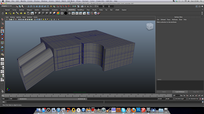
Here are the screenshots showing the multiple rooms and the typology (please excuse webcam image):